We have a few guidelines for using our logos and representing our brand accurately. Please familiarize yourself with them below and help us show up consistently everywhere.
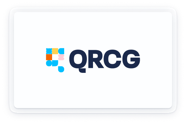
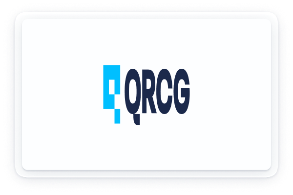
Logotype
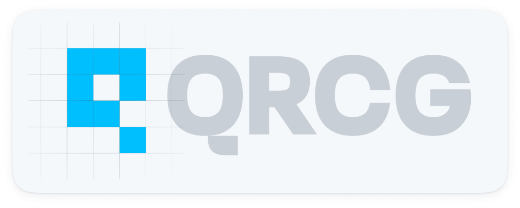
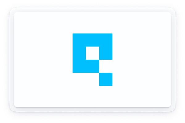
Logomark
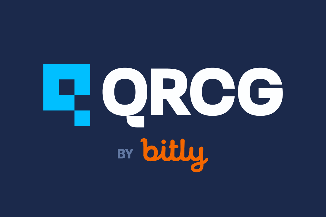
Our logomark draws inspiration from the intricate patterns of QR Codes, symbolizing connectivity and innovation.
It embodies the essence of modern technology while maintaining a sleek and recognizable design. This unique representation not only reflects our commitment to digital solutions but also invites engagement and interaction, much like the codes themselves.
Minimum Clearance
The minimum safety area surrounding the logo is crucial for maintaining its visual integrity.
Ensure that the logomark is used as a reference point for spacing, providing ample room around it to prevent any visual clutter. This area should be free of any text or graphic elements to allow the logo to stand out effectively. By adhering to these guidelines, we can ensure that the logo remains prominent and easily recognizable in all applications.
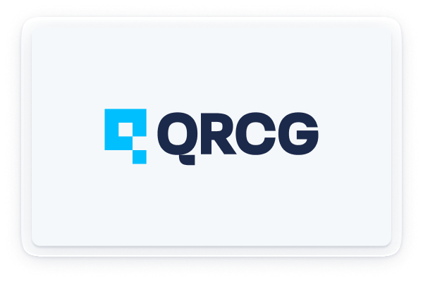
Minimum Size
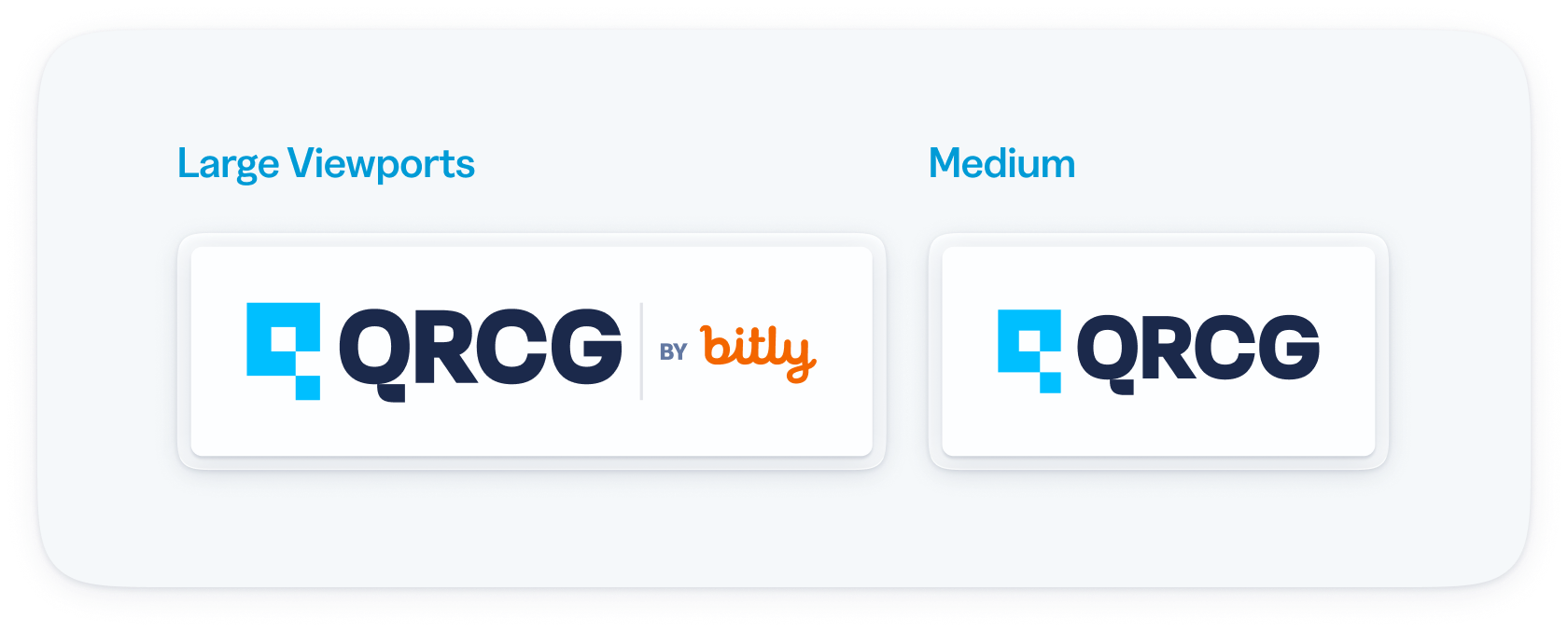
Here are several variations of our primary logo lockup designed for different canvas sizes.
When working with smaller dimensions, it’s best to opt for the logomark version to ensure clarity and visibility.
But do ensure that you don’t use any version of our logo that is smaller than 16px.
Logo Versions
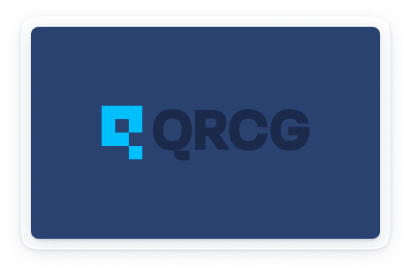
The QRCG logo is versatile and can be displayed on any of our primary brand colors and their various shades.
We prioritize brand visibility, so it’s essential to utilize the two-tone logo consistently across all platforms and materials.
While there may be instances where the glyph color is adjusted for specific contexts, please ensure that the wordmark remains in either Navy or Base to maintain brand integrity.
Alternate between Portrait and Landscape depending on the available space on the canvas.
Logo Crimes
The Do’s and Don’ts of using our logo
✅ DO use logo approved colors
❌ DO NOT redraw the logo or create your own version
❌ DO NOT redraw the logo or create your own version
❌ DO NOT have low contrast background or foreground colors
❌ DO NOT change colors
❌ DO NOT warp the logo in any way
❌ DO NOT use the glyph alone. DO use the glyph together with the wordmark
✅ DO place the logo in a quiet area
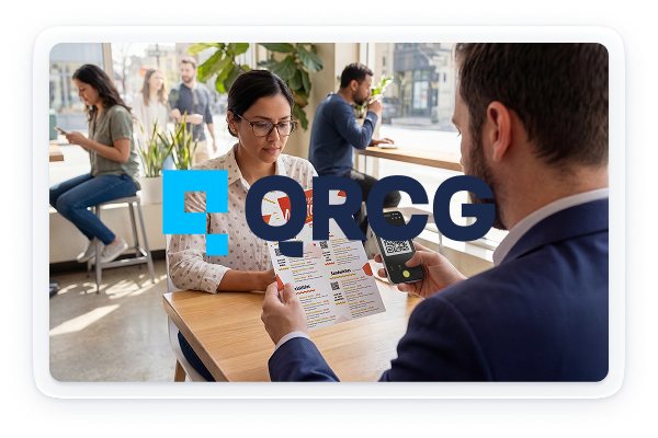
❌ DO NOT use on busy backgrounds
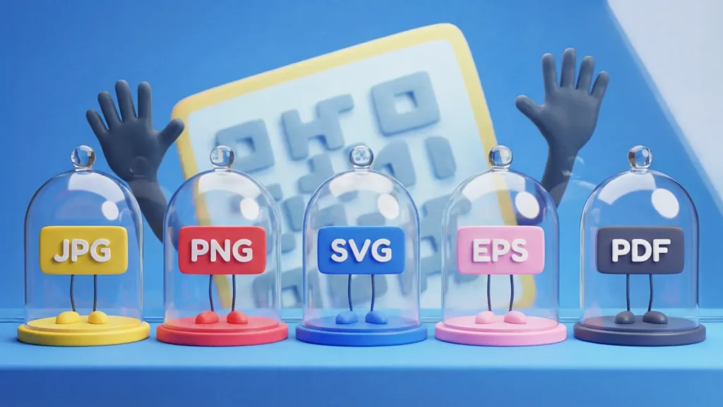
Download Logos & Brand Assets
Thanks for familiarizing yourself with our brand marks and logo usage guidelines. Access and download assets below.