Designing a QR Code With a Call to Action that Converts

Calls to action are one of the most foundational components of marketing, and you can find them everywhere. From social media posts to billboards, marketers are asking their audiences to engage and take action.
QR Code marketing is no exception—every QR Code benefits from a strong, clear call to action that engages your audience. With a good CTA, your audience might just get curious enough to scan.
What is a call to action?
A call to action, often referred to as a CTA, is a short phrase used to encourage a user to take a desired action, such as “Sign Up,” “Contact Us,” or “Buy Now.”
This is where the term “action” comes into play. The basic goal of all marketing strategies is to engage a user so that they do something that boosts your brand, like follow you on social media, download an ebook, or make a purchase.
Overall, the point of a CTA is to explicitly tell the user what you want them to do, which leads to better response and conversion rates. However, it also tells them what to expect when they scan and visit your QR Code landing page.
What to remember to create an effective call to action
It’s not easy to convince someone to take the next step. To give your call to action the best chance of converting your audience, you should follow these best practices that savvy digital marketers use.
Apply the “KISS” rule
KISS stands for “keep it short and simple.” This is absolutely true for any CTA—anytime, anywhere. The best CTAs are five words maximum, but two or three words are even better.
While it can be tempting to get clever with your copy, you should use easy-to-understand language so there is no chance that the user misses the point. CTAs like “Start Now” or even just “Purchase” can be really effective because there’s zero confusion about the purpose of that marketing material.
Fundamental, but easy to forget, is that the CTA should relate back to the goal of your campaign. If your goal is to get sign-ups, choose “Sign Up Now” over “Check Out Our Website.”
Use an action verb
Action verbs feel energetic and powerful to read. As a result, assertive action verbs are what drive conversions. Use the action verb in the imperative (command) form, like when you’re telling someone what to do.
Common assertive action verbs used in CTAs include shop, purchase, get, buy, sign up, start, go, etc.
Make them easy to find
Once you’ve written your short and active CTA, you also need to consider the design. CTAs should draw attention to themselves, and it should be clear where the reader needs to tap. There should also be a strong contrast between the text and background so they’re easy to read.
The page placement is also important—most marketers put CTAs at the top, front and center, so that readers don’t have to scroll. If the page is long, such as a blog post, putting a second CTA at the bottom will prevent readers from needing to scroll all the way back up to take action.
Display one at a time
One good CTA can be all you need for effective conversion rates. Use one too many, and it may confuse the reader, as they don’t know which one to focus on. It’s often the case that the best-designed landing pages have only one clear CTA that gets the user straight to the goal.
Make the value proposition obvious
A value proposition (value prop for short) answers the question: “What do I get?” In order to be convincing, you need to demonstrate the benefit to your audience.
Since CTAs are short, you’ll demonstrate most of the value prop on the rest of the page. But even simple CTAs detail what will happen when the audience clicks. For example, “Shop Now” promises an exciting online store in just two words.
“Shop the Sale Now” takes it further and reminds the audience they will save money. “Sign Up” is a bit vague, whereas ”Join Our Mailing List” offers a relationship.
The benefits of using CTAs with your QR Codes
QR Codes are amazing tools, but people don’t scan random QR Codes that lack context. A CTA is your opportunity to communicate with your audience and encourage them to scan.
Clear guidance
When users encounter a plain QR Code on a digital ad or physical marketing resource, the data it contains is invisible to the human eye. They may not know where it leads if they scan it. They also may not know what it is if they haven’t used QR Codes before.
Using a CTA with your QR Code is key to clarifying its purpose. It allows users to take the next step and scan. That’s why “Scan Me” is such a common CTA on QR Codes.
More engagement and conversion
A well-crafted CTA provides both guidance and convinces the user to scan. As we covered above, a good CTA offers a value prop and aligns with your goal.
If you write a convincing CTA, it will lead more people to scan—which means more conversions or customer engagement with your brand.
For example, an event poster could have a QR Code with a CTA that says “Scan to Buy Tickets.” A PSA about a public health issue could have a QR Code captioned “Scan to Learn More.”
Better user experience
Users are rightfully mistrustful of visiting strange web pages. In fact, public guidance advises users not to scan unlabeled QR Codes—bad actors could use them to trick users into visiting websites with malware.
Customers prefer to know what they can expect when they scan the code. It’s also a good idea to establish your authority where you placed the code. For example, you should name your company on the posters that contain the QR Code.
Practical targeting and tracking
CTAs allow you to target different audiences for the same purpose. For example, an ad on the subway and an ad in a magazine could have wildly different consumers, but you might be selling them the same thing. A CTA is an opportunity to personalize your ad for your target audience.
QR Codes also help you track the success of your campaign. If you put a plain URL on your event poster, you may see that you got web traffic, but you won’t know why or where it came from.
If users scan the QR Code on your event poster, you will know exactly which ad led your audience to your website, where, and when. QR Codes can even distinguish between unique users and repeat users.
Where should you use QR Code calls to action?
Nearly all QR Codes should have a call to action because it clarifies how a user should respond and engage. But you’ll especially want to include a CTA with your QR Code on things like:
- Event posters
- Billboard ads
- Video ads
- Subway ads
- Brochures
- Flyers
- Business cards
- Packaging
- Receipts
- Navigational signs
A call to action tells your audience what you want them to do, where the QR will take them, and what’s in it for them. So if any of those aspects are not clear, a CTA is the way to go.
How to enhance user engagement with strategic QR Code CTAs
Understanding best practices for using QR Code CTAs in your marketing materials is important. They can help you clarify the relevance of the linked content and tie it back to the purpose of the materials.
Connect the user to relevant content
CTAs should explain why the QR Code resource or content is relevant to the context. For example, an e-commerce sale poster should, naturally, link to the sales page.
The CTA is an opportunity to say “Scan to Shop the Sale,” explaining that the QR Code will help users access the savings. On that note, one effective way to convince customers to engage is to offer them a coupon upon scanning.
A QR Code on a print poster ad connects users with all the event info digitally
Embed CTAs in customized QR Code frames
When you design custom QR Codes with QR Code Generator PRO, you have the option to use custom frames or create your own. This is a great way to integrate the CTA into the QR Code itself, so you can use the rest of the space to communicate your message.
All QR Code frames include space to add your own unique CTA to match your marketing material.
Custom CTA text with QR Code Generator PRO
Design QR Codes with clear, effective CTAs in mind
Before designing a QR Code, decide on its purpose and what you want the user to do. Is it a QR Code survey designed to generate user reviews? A QR Code discount for new customers?
Printing QR Codes on your materials without clear CTAs in mind will result in cluttering your materials with a QR Code that doesn’t have a goal.
An example of a well-designed QR Code with a CTA on product packaging
Make your QR Code stand out with contrasting colors
QR Codes, like CTAs, should draw attention. Contrasting colors are a great way to make a QR Code more noticeable, ensuring more people engage with it. Color contrast also maintains the quiet zone on your QR Code so users don’t have problems scanning.
Ensure enough color contrast between the QR Code and the background
Optimize CTAs by tracking QR Code scans
To understand the success of any marketing campaign, you need to track it based on marketing metrics—and QR Code marketing campaigns are no exception.
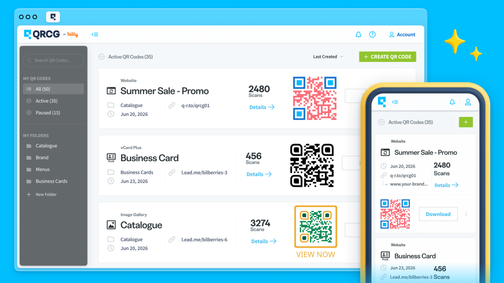
With QR Code Generator PRO, you can create both Static and Dynamic QR Codes. However, only Dynamic QR Codes display real-time tracking data, such as location by city and country, time scanned, unique vs. total scans, and operating device used.
You can use this information to optimize campaigns, and CTA testing often plays a major role here. To get the most out of your QR Codes, we absolutely recommend testing different CTAs over various time periods and locations and on different designs to see which ones are the most effective.
Tracking metrics available in QR Code Generator PRO
Create an influential QR Code call to action for better results
CTAs make QR Codes more powerful. You can communicate better with your audience, increase engagement, and use it as an opportunity to include more copy that converts.
QR Code Generator PRO allows you to generate and design personalized QR Codes with custom colors, text, and images. It’s an easy way to create QR Codes that better connect with your customers and encourage them to engage with your brand.
Sign up today to create an impactful QR Code with a CTA that will convert your customers.


